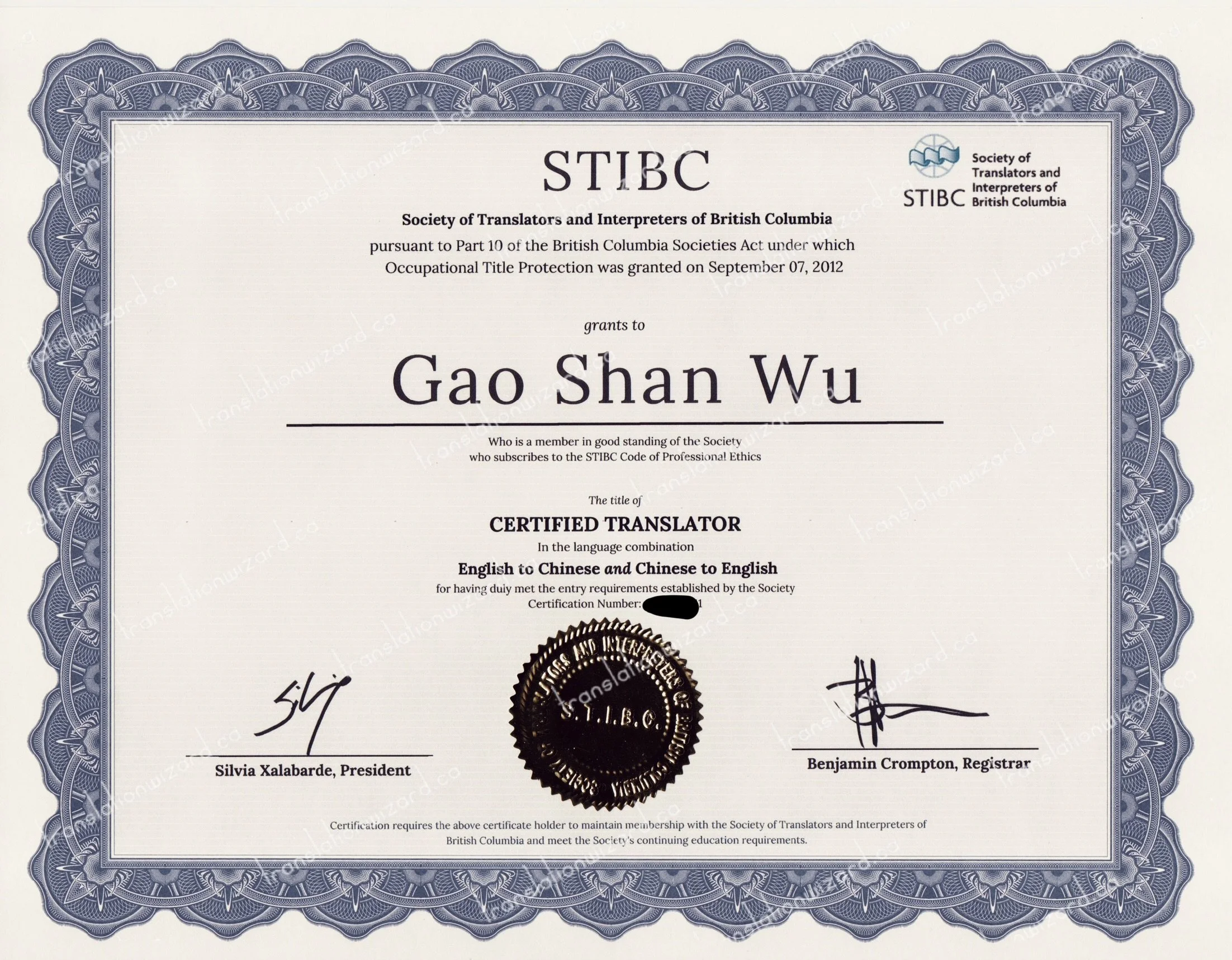
STIBC Certificate of Membership awarded to certified translator Gao Shan Wu, featuring an elaborate blue ornamental border, formal typography, an institutional seal and authorized signatures.
Professional certification is represented not only by qualifications recorded in an association’s official register, but also by the documents through which those qualifications are formally acknowledged.
The Certificate of Membership issued by the Society of Translators and Interpreters of British Columbia (STIBC) is an example of this tradition. Its elaborate ornamental border, carefully arranged typography, official seal and signatures combine to create a document that is both functional and visually distinguished.
This service is pleased to present the latest design of the STIBC Certificate of Membership issued to Gao Shan Wu, a certified translator in the language combinations of Chinese to English and English to Chinese. The following examination explores the certificate’s visual composition, individual elements and professional significance.
The Overall Design: Traditional Elegance and Formal Symmetry
At first glance, the most distinctive feature of the certificate is its broad, elaborately decorated blue border. Rather than adopting the minimal appearance of many contemporary professional documents, the certificate incorporates ornamental detailing reminiscent of traditional engraved certificates, historical securities and formal institutional documents. The restrained combination of blue, ivory and dark lettering contributes to its dignified appearance.
The overall composition is strongly symmetrical. The principal text occupies the central portion of the document, while the surrounding ornamental frame establishes a clearly defined boundary. This arrangement draws the viewer’s attention naturally toward the recipient’s name and professional designation. The spacious interior also allows the various elements to remain visually distinct without overwhelming the central text.
The Ornamental Border: Intricate Patterns and Repetition
The blue ornamental border deserves particular attention. It consists of repeated decorative units arranged around all four sides of the certificate. Curved outlines, radiating lines, interwoven patterns and finely detailed geometric forms create an elaborate visual structure. The outer edges follow a rhythmic, scalloped contour, while the inner edges form a more restrained rectangular boundary. These contrasting shapes are particularly effective. The decorative outer border provides richness and visual interest, while the straight inner border maintains the document’s formal structure. The repeating patterns also create a sense of continuity. Each section contributes to a larger unified design, giving the certificate an appearance associated with traditional ornamental printing. The result is intricate without being excessively colourful.
The STIBC Name and Institutional Emblem
At the top centre of the certificate, the letters STIBC appear prominently in a large serif typeface. Immediately beneath them is the association’s full English name: Society of Translators and Interpreters of British Columbia. A separate STIBC emblem and accompanying association name appear in the upper-right portion of the certificate. This arrangement combines a traditional central heading with a recognizable institutional visual identity. The use of serif typography in the main heading reinforces the formal character of the document, while the smaller emblem provides a contemporary element within the otherwise traditional composition.
The Legislative Reference
Below the association’s name, the certificate contains a statement referring to Part 10 of the British Columbia Societies Act and the granting of occupational title protection on September 7, 2012. This reference gives the certificate an institutional and legislative context. Its placement near the top is significant from a design perspective. Before the recipient’s name appears, the document identifies the issuing association and refers to the framework associated with its protected professional titles. The statement is presented in smaller serif lettering, maintaining the visual hierarchy between the institutional heading, the explanatory text and the recipient’s name. The certificate itself should not, however, be understood as a government-issued licence or as a substitute for verification of a translator’s current professional status.
The Recipient’s Name: A Central Point of Emphasis
The recipient’s name, Gao Shan Wu, occupies the most visually prominent position in the centre of the certificate. It is printed in a large, elegant serif typeface, with generous spacing and a strong horizontal line immediately beneath it. The effect is both formal and personal. While the surrounding elements establish the authority and identity of the issuing association, the central name identifies the individual to whom the professional designation has been granted. Directly below the name, the certificate describes the recipient as a member in good standing of the Society who subscribes to the STIBC Code of Professional Ethics. This statement introduces the relationship between professional recognition, membership standing and ethical responsibilities.
The Professional Designation and Language Combinations
Below the recipient’s name appears the professional designation: CERTIFIED TRANSLATOR. The designation is printed in bold uppercase lettering, making it one of the most important elements of the document. Immediately beneath it, the certificate identifies the recognized language combinations: English to Chinese and Chinese to English. These are two distinct translation directions. English-to-Chinese translation involves rendering English-language source documents into Chinese, while Chinese-to-English translation involves rendering Chinese-language source documents into English. The explicit identification of both directions is important because professional translation qualifications are associated with particular language combinations. The certificate also includes a certification number, which has been partially obscured in the publicly displayed image. This is a deliberate presentation measure and does not affect the underlying official certificate.
The Official Seal: A Traditional Element of Authentication
Near the lower centre of the certificate is a prominent circular STIBC seal. Its dark appearance contrasts with the light background and the surrounding blue ornamental border. The seal incorporates circular lettering, a central abbreviation and a serrated outer edge resembling traditional embossed or impressed institutional seals. Its placement at the bottom centre provides a visual anchor for the document. The circular form also contrasts with the rectangular border and the predominantly horizontal arrangement of the text. In the scanned image, the seal appears very dark, and some details are affected by reflections from its metallic surface. These reflections are a characteristic of the reproduction process rather than an intentional alteration of the original seal. The published image is intended for visual presentation. Authentication of professional credentials should rely on the issuing association’s official records rather than the appearance of a reproduced seal alone.
The President’s and Registrar’s Signatures
Two signatures appear near the lower portion of the certificate, positioned on opposite sides of the central seal. The left-hand signature is identified as that of the President, while the right-hand signature is identified as that of the Registrar. The arrangement creates a balanced three-part composition: signature, seal and signature. Beneath each signature is a horizontal line and the corresponding printed name and office. This format recalls the conventions of formal certificates, in which authorized signatures and institutional seals accompany the principal declaration. Visually, the handwritten signatures also provide an organic contrast to the precise printed lettering and repeated decorative patterns.
The Continuing Nature of Professional Certification
At the bottom of the certificate, a small-print statement explains that maintaining certification requires continued membership in STIBC and compliance with the Society’s continuing education requirements. This is an important distinction. The certificate represents a professional designation, but the holder’s ongoing standing remains subject to the applicable membership and professional requirements. Accordingly, a publicly displayed certificate should be understood as evidence of professional recognition at the time of issue, rather than as an unconditional guarantee of current status indefinitely. Current standing should be confirmed through the relevant professional association.
The Certificate as an Example of Formal Document Design
From a visual perspective, the certificate brings together several traditions of formal document design. Its ornamental blue border recalls engraved institutional documents. Its serif typography communicates formality. The recipient’s name establishes a clear focal point, while the professional designation, signatures and seal provide supporting visual structure. The combination is particularly effective because each element has a distinct purpose. The border frames the document. The association’s name establishes its institutional origin. The recipient’s name and designation identify the recognized professional qualification. The signatures and seal complete the formal presentation. Together, these elements give the certificate a traditional and dignified appearance.
About the Certified Translator at This Service
Gao Shan Wu is a certified translator recognized by both STIBC and the Association of Translators and Interpreters of Ontario (ATIO). The STIBC certification covers English to Chinese and Chinese to English, while the ATIO certification covers Chinese to English. This service provides certified translation services for various official, personal, educational and administrative documents. All translation work is undertaken personally by the designated certified translator, including document preparation, translation, proofreading and layout reconstruction. Translation work is not outsourced. The objective is to produce complete, accurate and professionally presented translations that faithfully reflect the source documents. Acceptance requirements remain subject to the policies and decisions of the receiving authority.
A Certificate Worth Appreciating
The STIBC Certificate of Membership is more than a document bearing a name and professional designation. Its carefully structured layout, elaborate blue ornamental border, formal typography, association emblem, central seal and accompanying signatures reflect a longstanding tradition of presenting professional recognition through distinguished printed documents. The latest design is particularly appealing for its balance of decorative richness and institutional formality. For this service, displaying this certificate serves two purposes: presenting the certified translator’s professional qualifications and inviting visitors to appreciate the craftsmanship and visual design of the document itself.
Official website: https://translationwizard.ca
Certified translation enquiries and document uploads: https://translationwizard.ca/quote
The accompanying certificate image contains protective watermarks and a partially obscured certification number. Professional credentials should be verified through the relevant association’s official records.